


Blogs
|
This week’s e-learning challenge is an interesting one…one that is often glossed over in discussions, but which has also been discussed at length (if you look for it): Storyboard Templates! Hooray! I’ve chatted about storyboarding vs. rapid prototyping here and created a jaunty time-lapse demonstration of the development of a very basic storyboard template here (along with a downloadable template - wahoo!), but I’m going to go through David’s questions and maybe even include some downloadable sample templates. GET EXCITED!!!
The Concept
Share an example of your preferred storyboard template and answer the following questions:
How do you define scripting, storyboarding, and prototyping? Which method do you prefer?
Do you use different types of storyboards? When do you use each?
How do you storyboard interactivity?
What are your top three storyboard tips for new course creators?
The Method
First, I considered my storyboarding preferences and sifted through my hard drive to locate some samples. I realized that I had previously included my preferred storyboard template (and by preferred, I mean most commonly used and/or adapted for use) here.
Then, I considered each question and jotted down some note for each.
The Result
By clicking here, you can download my preferred/most commonly used and/or adapted for use storyboard template.
How do you define scripting, storyboarding, and prototyping? Which method do you prefer?
I previously defined storyboarding and prototyping over here, so I won’t bore you with a re-ramble of that post. As far as scripting goes, I would consider this to be including verbatim onscreen text, narration, and or media element scripts for other developers (and/or yourself as an organization tool). When scripting audio narration, I also would define aspects of the script to clarify the verbatim narration (e.g. pronunciation).
I prefer rapid prototyping overall, but find it most effective with smaller projects, requiring less sign off from other individuals. With larger courses/products, I prefer to storyboard in a Microsoft Word template as it’s much easier (and cost effective) to modify a Word document than a developed file.
Do you use different types of storyboards? When do you use each?
I do you different types of storyboards, but it really depends on the clients needs. If they’re able to visualize the overall course based on a detailed Word storyboard, I’ll do that. If they need something more visual, I’ll develop a visual storyboard in Microsoft PowerPoint or Articulate Storyline. If a complex branching scenario is used, I’ll refer to a Word storyboard in a task analysis template (e.g. where each cause and effect task is branched out appropriately). If the client requires an Excel template, I’ll cringe and comply (and sob).
How do you storyboard interactivity?
My typical method for storyboarding interactivity is to create detailed accounts (occasionally supplemented with mocked up visuals - for complicated media descriptions) of the media and interactivity to be included on that screen. This tends me be adequate, but sometimes clients (or Subject Matter Experts) need more of a visual, in which case, I’ll do a visual storyboard using PowerPoint and include descriptions of the interactions or mock them up as much as possible (using animation effects) to convey a similar look and feel of the end product.
What are your top three storyboard tips for new course creators?
BE CONCISE in your onscreen content - no one likes scrolling (too much).
Ensure all aspects required for development are accounted for within the storyboard (e.g. navigation, introduction, conclusion screens, interactivity, audio script) - it’s good to have a one-stop-shop approach to your storyboard templates.
Be as detailed as possible in your media descriptions; often times in larger organizations, the storyboard gets handed off to a media developer and then maybe a programmer, and you want to be as detailed as possible to avoid back and forth communication regarding elements. Doing this will save you time, money, and frustration. AND - everyone will be on the same page (e.g. the media developer can get added context for a screen by reading the onscreen text, and the programmer has a better understanding of how to program the media interactivity by reading the media description). All aboard!
Ashley Chiasson
.
Blog
.
<span class='date ' tip=''><i class='icon-time'></i> Jul 15, 2015 12:54pm</span>
|
|
In an industry like sales, when employees don’t take training seriously, they don’t learn the concepts you want them to learn. In the case of utility workers, not taking training seriously could be a significant safety matter.
Take the example of DTE Energy. As a Fortune 500 energy company, DTE wanted employees to take pre-job safety briefings seriously. Instead, they saw inattentive body language from participants and a lack of effective teaching methods from supervisors. To fix this problem, DTE created a video-based program with Expand that took a playful approach, while also demonstrating the importance of the information included. You can check out some clips from the finished product here.
Expand Interactive Team
.
Blog
.
<span class='date ' tip=''><i class='icon-time'></i> Jul 15, 2015 12:54pm</span>
|
|
I was inspired to write about style guides after seeing a very beautiful one for a current client. As dorky as it might sound, I get incredibly excited about style guides!
Style guides?!
Style guides are typically client-generated; however, I have worked for organizations where various departments (e.g. Instructional Design, Programming, Multimedia) contribute to the development of a client’s style guide. They are documented explanations and illustrations of stylistic options that are available for the product in development.
These stylistic options typically include approved logos and branding, colours (and corresponding hex values), appropriate fonts and sizes, and can even be so specific as to dictate the pixel width a highlight box must be or the screen resolution the product must adhere to.
Basically, the style guide dictates how your product should look/feel and is typically developed by the client in an effort to stay ‘on brand’. Other elements can even include the tone of voice used (active vs passive) or grammar preferences.
But why should I be interested in these?
Now, I’m not saying you need to get giddy about a beautifully crafted style guide like I do, but what I am saying is that you probably should inquire as to whether your client has one. Why? Because doing so can save a lot of time and effort spent revising a developed product to adhere to the company’s branding standards. It can be very tedious changing fonts and sizes for large projects…
Another great thing about style guides is that they ensure that all team members (if there are more than just yourself) have the same information and are adhering to the client’s aesthetic requirements. This can yield an incredible cost savings when you consider the effort involved in reprogramming interactive pieces or re-developing multimedia assets.
Style guides also save you tons of time and guess work! The projects I’ve worked on that had prescribed style guides had a lot less back and forth stylistic revisions than those without. While designing different layouts and using different typography may be your jam, clients may feel like you failed to read their mind with regarding to determining their brand’s vibe. No one wants you to miss the mark!
Here are some handy resources:
Style Guides for E-Learning Courses
Brand Guidelines
Creating a Yearbook Style Guide
Style Guide: How relevant is it in an e-Learning course?
Ashley Chiasson
.
Blog
.
<span class='date ' tip=''><i class='icon-time'></i> Jul 15, 2015 12:54pm</span>
|
|
There are few managers who would disagree that a comprehensive training program is vital to the success of a sales team. However, if you’ve worked with salespeople in any capacity you know these folks are professional multitaskers. Driving and working at the same time? No problem! (We don’t endorse that habit...safety first, people!) Considering they are usually incentivized for capturing new business, responding to client and prospect inquiries is their top priority. They’ll duck out of meetings to take phone calls, check their email constantly and are often researching their next target.
Expand Interactive Team
.
Blog
.
<span class='date ' tip=''><i class='icon-time'></i> Jul 15, 2015 12:54pm</span>
|
|
The benefits of investing better sales training are vast. From higher return on investment to shaping better employees who stay longer, there’s little reason not to explore the possibilities for streamlining sales training. But between your employees, outside managers and company higher-ups, everyone has their own idea of how to streamline sales training. So how do you know what you really need for more engaging and effective sales training?
Expand Interactive Team
.
Blog
.
<span class='date ' tip=''><i class='icon-time'></i> Jul 15, 2015 12:54pm</span>
|
|
Pantone announced that the 2014 colour of the year was Radiant Orchid. And how I feel about it? - What’s pretty for none is hideous to some. I’m sorry, Pantone. You dropped the ball on the colour for me this year. Purple is one of my very favourite colours, but this shade of purple is just acrid to me.
The Concept
This challenge was to create a ‘radiant’ template using Radiant Orchid as the colour palette of choice. I’m going to sound like I’m making excuses here, and I am. But, I truly struggled with creating this template because I found everything I created to just look so vile. However, perhaps some of you appreciate Radiant Orchid and will also appreciate these layout templates I developed - who knows?!
The Method
First, I checked out the colour and applied it as a background colour to one slide. I wasn’t a fan, but I had to move forward. I found adding a gradient helped a bit, so I did that and went with it.
Then, I considered several basic screen layouts and sought about developing them, added some navigational elements (e.g. chevrons instead of the back/next button default), and tossed some placeholder layers in for the buttons.
The Result
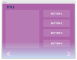
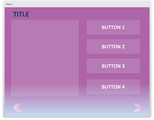
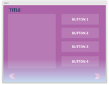
The fruits of my labour were six screen layouts that you can customize any which way you choose - I tried to appeal to some of the most commonly encountered layouts, so hopefully they will address your template needs. Below, you will see a screenshot of one of the layouts included, and you will be provided with a link to the demo and the downloadable .story file. Go forth, spread the cheer of Pantone’s colour of the year!
Click here to view a demo of the full Radiant Orchid template.
Click here to download the full Radiant Orchid .story file for Articulate Storyline.
Ashley Chiasson
.
Blog
.
<span class='date ' tip=''><i class='icon-time'></i> Jul 15, 2015 12:54pm</span>
|
|
They say the definition of insanity is doing the same thing over and over again and expecting different results. Now, we’re not saying continuing to use inefficient knowledge practices is cause for a straight jacket…but it’s probably a good indicator it’s time to try something different. After all, what’s the point in devoting time, money and energy to training your employees if you aren’t seeing the results you want?
Time spent training your employees is already time spent away from their job duties. Naturally, you want this to be worthwhile. Fulfilling eLearning requirements shouldn’t just be a box your employees can check once they’ve gone through the motions. It should be an engaging, enriching and knowledge-expanding experience that better prepares them to perform on the job. All too often, we see companies caught up in what we’ll call "for the sake of it" employee training. They’re perpetuating outdated and ineffective methods simply to say training was completed regardless of whether it had any positive impact.
This is especially prevalent with ineffective eLearning. It’s easy to feel like your company is on the cutting edge if you’re simply using online training. However, we all know, when not done properly, online training can be just as unsuccessful as the old methods it was working to replace.
How about we say goodbye to inefficient learning practices once and for all? Here are three that we wouldn’t mind never seeing again.
The Non-engaging Page Turner: Click. Click. Click. Your employees might continue to hit "next" in a PowerPoint presentation, but that doesn’t mean they’re absorbing the information in front of them. Without some level of engagement or interaction, "page turner" training isn’t likely to reach the large majority of your employees. While some might take the initiative to really delve into their learning, most will likely just be interested in completion "for the sake of it."
The One Size Fits All: Your employees are not all the same. They’re more likely to benefit from eLearning that values their individualism. More than just working alone at their own pace, a truly individualized solution needs to interact with the learner based on their performance.
The Did It and Done: Without employing some level of assessment or comprehension check, your employees can easily do their training and be done with it. eLearning that promotes engagement with the material and interactive assessments are more likely to ensure concepts stick with them long after they’re done clicking.
You don’t want your training program to be just another day at the office. Instead, it should make your employees feel valued for the work they’ve done and motivated for the work they’re going to do.
Want a training solution that won’t perpetuate these inefficient eLearning practices? Check out Expand Share.
Expand Interactive Team
.
Blog
.
<span class='date ' tip=''><i class='icon-time'></i> Jul 15, 2015 12:54pm</span>
|
|
People are always asking me what skills they should learn in order to be a successful Instructional Designer (ID), and there really is no hard fast recommendation. There isn’t one formula that will spit out the perfect ID, but there are a ton of adjacent competencies that IDs might want to focus on. In addition to enchanting your mind with new information and ways of doing things, these suggestions may also make you a bit more marketable within the ID world.
1. Education
IDs come from all walks of life - I had a Linguistics background when I hit the ground running as an ID, but it truly is important to know where you came from (so to speak) and learn about the principles behind Instructional Design. This could be through formal education, through books, or through a community of peers (just to name a few options). Whatever you choose, be eager to understand why it is you’re doing the things you’re doing within your Instructional Design, and how you can improve the user experience and optimize success (for the program AND the student).
Design for How People Learn by Julie Dirksen
The Accidental Instructional Designer: Learning Design for the Digital Age by Cammy Bean
Instructional Design Essentials: Models of ID
Instructional Design Essentials: Needs Analysis
Instructional Design Essentials: Storyboarding
E-Learning Heroes Community
2. Graphic Design
Some IDs pride themselves in being creative and capable graphic designers, but there is a large population of IDs who have what feels like zero creativity (me on most days) and who have minimal artistic ability (me, me, me!). In my first corporate gig, I was spoiled with a team of multimedia developers who would cater to most all of my whims and requests. Now as an independent, I’m often left to my own devices (or to sub-contracting out graphic design projects). With that being said, I do know my (truncated) way around Adobe Photoshop, and in a pinch I can do some very basic things (you also might not believe what a useful resource PowerPoint can be!). Here are some resources I would recommend for brushing up on some basic graphic design skills:
Photoshop Accelerated
Introduction to Graphic Design
How to Create Your Own Illustrated Graphics in PowerPoint
The Doodle Revolution by Sunni Brown
3. Programming Languages
This here is something I don’t have a lot of experience in, but it’s worth learning how to code basic HTML, JavaScript, and CSS in the event that you need some of this code for your e-learning projects. Now, again, this is not an essential skill of a ‘good’ ID, it’s just a nice-to-have skill and likely will come in handy every now and again. There are other roads you can go down if you’re genuinely enthused by learning programming languages - e.g. Learning something like Unity to program 3D scenarios, but I reckon you should research further than this post if you’re serious about learning programming languages…because I’m not the guru for you! Within authoring environments, code can be handy to know even to just troubleshoot why a Learning Management System isn’t ‘reading’ your SCORM package despite you having properly ‘SCORM’ed’ it.
Code Academy
Ladies Learning Code (I really enjoyed the HTML/CSS course!)
Introducing the JavaScript Language
Ashley Chiasson
.
Blog
.
<span class='date ' tip=''><i class='icon-time'></i> Jul 15, 2015 12:54pm</span>
|
|
One of the biggest challenges eLearning poses is how to replicate the human connection workers might be used to experiencing with in-person training. The voiceover is a crucial element to capturing your audience’s attention throughout the duration of their training. The wrong voice can quickly cause attention spans to deteriorate or turn learners off from the start.
Even though the utility workers in this video were acting, their response is a pretty accurate representation of how quickly most utility workers will be able to tune out if they don’t connect with the voice. We get it: Sitting through an eLearning program is already taking utility workers out of their element. They’re used to being active on the job and learning through experience. If your eLearning course isn’t delivered through a voice they connect with, you’ll just be wasting your (and their) time.
So does this mean you should just throw in the towel on eLearning for your utility workers? Far from it! While it might take a little more finesse to find the right voice to deliver such important information, it can certainly be done.
Since picking the right voice actor can be an overwhelming task (So many choices! So many voices!), we created a checklist to help you determine if a voice is the right fit for training your utility workers.
6 Must-Have Qualities of a Voiceover for Training Utility Workers
Authority: Utility workers know their job and they know it well. They aren’t going to tolerate a voice that doesn’t take on a degree of authority over the content. The voice you choose should come across as knowledgeable and confident.
Authenticity: Even though you may be hiring a voice actor to deliver your eLearning course, he or she needs to be believable. The voice should sound authentic to their industry, as if it could walk right out of the screen and join in on the work.
Accessibility: Being able to easily understand the voiceover will make utility workers more likely to invest in the content they are learning. Think friendly but not overly casual. The right voice should be accessible without being distracting.
Captivating: If the voice of your eLearning isn’t interested in the material, your utility workers won’t be either. Finding a voice that can capture and keep their attention is important to the success of your training.
Avoids Condescension: Your utility workers take a lot of pride in their work, so the last thing they want is to feel talked down to. If their training comes across as condescending, your workers will be turned off from the start.
Recognizable: The voice artist for your eLearning should feel like just another co-worker to your utility workers. If they recognize themselves and each other in the tone and approach, they’ll be more likely to pay attention and benefit from the information.
Our final tip is this: Don’t be afraid to ask for feedback. Or, if you’ve had unsuccessful training programs in the past, ask your workers what it was that they didn’t connect with. Their perspective can make all the difference.
Interested in learning more about how to make your eLearning more effective? Let us help.
Expand Interactive Team
.
Blog
.
<span class='date ' tip=''><i class='icon-time'></i> Jul 15, 2015 12:54pm</span>
|
|
The Concept
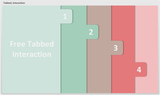
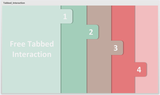
This challenge was to create our best tabs interaction; while I don’t necessarily consider this to be the best tabs interaction I’ve developed, I do think it’s a cute little one! The challenge specifically asked for five tabs, but I used four because a colour palette drove my inspiration.
The Method
I was trolling around Colour Lovers and stumbled upon a pretty colour palette, so I skimmed through the e-learning challenges to see which challenge I could best apply the colour palette to.
Then, I decided I wanted to do an in and out type of theme - reminiscent of those pop-up books you used to read as a kid, with the tabs to drag items across the page.
Once I had the general idea, I created some tabs and ‘pages’, adding shadows to the pages and tabs to emphasize that each is a separate item. Then I created a layer for each tab, and when selected, the appropriate tab would display.
The Result
Click here for a demo of the full interaction.
Click here to download the Articulate Storyline template of this free tabbed interaction.
Ashley Chiasson
.
Blog
.
<span class='date ' tip=''><i class='icon-time'></i> Jul 15, 2015 12:54pm</span>
|