


Blogs
|
Drafted at: Costa Coffee, Farringdon
Last Thursday (7th March 2012) saw the launch of the eagerly awaited iPad 3. As usual with a new Apple device the blogosphere has been full of speculation about what new features will be included. Speculation it has to be because Apple’s approach to marketing is to build hype as a new product launch approaches. If you are interested there was an excellent article in the May 2012 edition of PC Pro comparing Apple’s and Microsoft’s vastly differing approaches regarding new product launches - and guess what? Microsoft comes out as the good guy - it shares a lot of stuff with its developer community prior to key launches.
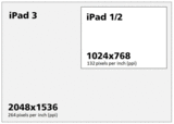
So what does the iPad 3 bring to the tablet party? Well not that much surprisingly. The headline feature is the ‘invisible pixel’ Retina display - imagine 4 iPad 2 screens tiled together and you begin to get a feel for how sexy this is going to be (I haven’t actually seen an iPad3 at this point but I’m already salivating).
iPad Screen Resolutions Compared (same 9.7 inch screen diagonal)
Apart from the sexy display we get 4G network access (well we will when we get a 4G network in the UK), a faster chip and a better camera and video capability. The battery also has a higher capacity (70% higher) but this doesn’t deliver any extra usable life which remains around the 10 hour mark. Sadly all this loveliness has resulted in extra thickness and extra weight. Think something between an iPad 1 and iPad 2. This doesn’t bother me being an iPad 1 owner but all those celebs are going to whinge about the extra room it will take up in their Gucci handbags.
So what will this new form factor mean for m-learning and e-learning? Well as a learning designer I love the idea of the extra pixel real estate but in practice these pixels aren’t that usable. Why? Because the pixel density is so high - much of the benefit ends up simply in improving the interface resolution. In other words smoother fonts and more curvy buttons. Most conventional e-learning content is designed to display at 1024×768 max. Some content scales - Articulate can publish so that it scales but this degrades quality. Of course since the iPad 3 doesn’t support Flash this is a hypothetical issue anyway. The extra pixels will improve video and will also benefit LMS platforms which can make use of the extra screen real estate for their interfaces.
A 'standard' resolution e-learning module running on an iPad 3
The iPad 3 is available in the UK on March 16th. Anybody want to buy my old iPad 1? Or maybe I should wait for a sexy new Windows 8 tablet?
John Curran
.
Blog
.
<span class='date ' tip=''><i class='icon-time'></i> Jul 15, 2015 06:29am</span>
|
|
Frustrated because you can't find the right photo? Cry along with me.Post from: The eLearning Coach21 Reasons Why Stock Photo Sites Make Me Cry
Connie Malamed
.
Blog
.
<span class='date ' tip=''><i class='icon-time'></i> Jul 15, 2015 06:29am</span>
|
|
Developing e-learning courses that aren’t simply page turners isn’t straightforward (guess that’s why us learning designers are still able to make a meagre living). It takes a lot of experience both of learning design and learning technologies combined to create engaging online learning experiences. However, there are some simple rules and methods you can follow to help ensure that your e-learning is more than just a boring old page turner.
In this article I will describe a really simple approach that I first came across in ‘E-Learning by Design‘ by William Horton and which I use as a core part of my ‘Instructional Design for e-Learning‘ course. It’s called the ‘Absorb/Do/Connect’ approach.
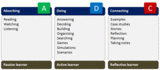
The idea is that for each topic in your e-learning course you create three elements:
AbsorbAn absorb element where you introduce the topic and provide a knowledge primer. In this phase the learner is absorbing new knowledge (or possibly refreshing existing knowledge). The absorb elements could be following a presentation, reading text, watching video, or exploring a diagram for example.
DoA do element where the learner then applies that knowledge - usually in an activity. The activity may also require the learner to apply pre-existing knowledge or even to fill in the gaps in what they were given in the absorb activity.
ConnectFinally the connect element links what they have done with their own real world situation. This could be an example from their own organisation or a practical exercise or assignment that links back into the workplace. A job aid could also be used as a connect activity.
Examples of Absorb, Do and Connect Activities
Not all topics will require all elements. Simple topics may just need an ‘absorb’ element, others an ‘absorb’ and a ‘do’, and some might skip the ‘absorb’ and drop learners straight into a ‘do’ or even a ‘connect’. It’s also possible to swap the order - a ‘do’ followed by an ‘absorb’ (this follows the age old principle of dropping learners in at the deep end and then following up with feedback).
That’s it. Simple but actually quite effective. And it works whether you are developing conventional SCORM e-learning packages or more flexible learning pathways delivered via an LMS or a VLE like Moodle or Willow’s Pathway platform.
Here’s an example of the approach applied to an online course on fire safety:
John Curran
.
Blog
.
<span class='date ' tip=''><i class='icon-time'></i> Jul 15, 2015 06:29am</span>
|
|
It's fun, accessible and practical. A painless way to learn instructional design.Post from: The eLearning CoachDesign For How People Learn: Book Review
Connie Malamed
.
Blog
.
<span class='date ' tip=''><i class='icon-time'></i> Jul 15, 2015 06:29am</span>
|
|
Expand your horizons and explore these ways to learn this year.Post from: The eLearning Coach12 Ways To Learn In 2012
Connie Malamed
.
Blog
.
<span class='date ' tip=''><i class='icon-time'></i> Jul 15, 2015 06:29am</span>
|
|
So we now have a ‘newish iPad’. But as I wrote in an earlier post Apple haven’t moved the tablet concept any further forward. The biggest improvement is the resolution of the display which now gives app developers considerably more pixels to play with. This potentially means more complex interfaces but we are limited on a touch device by the ‘resolution’ of a human finger. I have an iPad 1 so one of the things I am thinking about is how will the extra pixel real estate make a difference to my favourite apps and also to the web browsing experience. Will these extra pixels (four times as many in fact) make an appreciable difference?
Disappointingly there was no major upgrade to the user interface. This is an issue because the simple ‘pages of buttons’ interface is looking outdated and clumsy. The new Android tablets have recognised this and developed UIs that don’t treat every function in the same way and plonk a button in the midst of hundreds of other buttons. The Apple UI still works well on the small screen iPhone but on the larger (and now much higher resolution) iPad screen the rows of endless buttons is a real drag. Want to add a new app? Once installed it appears on the last page (I currently have 6 pages and I’m a light user). Need to make that app more prominent by putting it on your primary home page? You have to slowly coax it through 5 pages. The multitasking is also a real pain to use and switching between apps using four finger gestures is not the most intuitive UX. If you haven’t experienced this then try switching on ‘Multitasking Gestures’ in ‘Settings>General’.
Some comentators have suggested that Apple are less interested now in elegant interfaces and more in ensuring that the OS that runs their revenue generating apps stays simple and robust. I hope this isn’t the case.
Recently I saw a demo of the tablet version of Windows 8. It was impressive. Microsoft have re-engineered the touch interface. It’s more complex than Apples’ but for most savvy tech users it appears to add a lot of extra power and functionality.
Click on the above images to see in ‘gallery view’.
Apple are currently way ahead in the tablet wars. Even if their UI is a bit outdated they still have the most comprehensive app store by far. But things don’t stay still in tech for long and I can’t wait to have a play with Windows 8 on a tablet. The question is do I hold back on buying an iPad 3 in the meantime?
John Curran
.
Blog
.
<span class='date ' tip=''><i class='icon-time'></i> Jul 15, 2015 06:29am</span>
|
|
New knowledge builds on existing knowledge.Post from: The eLearning CoachCan you read the minds of your learners?
Connie Malamed
.
Blog
.
<span class='date ' tip=''><i class='icon-time'></i> Jul 15, 2015 06:28am</span>
|
|
On the BBC news last week there was some criticism of A Levels (the pre-university qualifications used in the UK). One university admissions spokesperson said that in some cases courses had become too ‘modular’.
Some of the courses have become too modularised. The focus is on learning a chunk of content then testing that content immediately afterwards. This approach has resulted in an approach that encourages ‘learning to forget’.
I think anyone involved in e-learning would recognise this behaviour of ‘learning to forget’ but instead of modules lasting three months ours last just 30 minutes!
Of course taking a 30 minute e-learning module on Time Management or even a 3 month A Level Module on Oilfield Geology isn’t going to result in deep learning. It can only prepare the ground for true learning by application later - most learning interventions focus on this exposition phase with maybe a little activity in the instruction phase (see Clive Shepherd’s post). Only occasionally do we take it to the higher phases - guided discovery or exploration.
Learning to forget is likely to characterise much of our ‘learning’ in today’s information rich environment. Increasingly we will be exposed to vast quantities of information and knowledge. Whether we simply scan that information or embed it deeper build on it and synthesise from it will depend upon our motivations, needs and preferences.
John Curran
.
Blog
.
<span class='date ' tip=''><i class='icon-time'></i> Jul 15, 2015 06:28am</span>
|
|
Review of a tool that builds interactions.Post from: The eLearning CoachHow to Create Interactions With Raptivity
Connie Malamed
.
Blog
.
<span class='date ' tip=''><i class='icon-time'></i> Jul 15, 2015 06:28am</span>
|
|
Do you love your LMS? In my experience most people have a real love hate relationship with their LMS - with the balance generally tipping in hate’s favour. It looks horrible, has a clunky admin area and generally makes things harder to do than they should be. Why is this? Well an LMS is primarily a ‘management system’ rather that a ‘learning system’. Think little ‘l’ big ‘MS’ not big ‘L’ little ‘ms’.
LMS are designed by techies for administrators to manage learning resources and learners. They don’t actually manage learning at all - only the evidence that some learning may have been done - in the sense that someone accessed a course, went through all the screens and then passed the test. The result is that the learner experience on most LMS’ is pretty dismal. This is a real problem because the LMS effectively provides the ecosystem which is supposed to facilitate learning. In practice it feels like a big repository of stuff.
Things are changing however, with the rise of social media platforms, LMS’ are having to adapt and become more of a learning space rather than a repository of learning resources.
What constitutes e-learning or online learning is also changing with video replacing conventional SCORM modules on some of the newer learning platforms. Add to this the increasing interest in social learning , performance support, curation, gamification and user generated content (UGC) and suddenly existing LMS’ look like a technology from the stone age. Of course most online learning is still directed and managed and requires the structure that a conventional LMS provides but if you are investigating a new online learning platform there are some interesting alternatives out there.
Here are two new kids on the block that are worth a look:
Fuse
A ‘video-centric social learning’ platform from Fusion Universal. Fuse dispenses with the SCORM package and gets down and dirty with lots of videos and UGC YouTube style. It includes quiz functionality too so you get to test your users once they have watched the relevant videos.
Learn more about Fuse
Curatr
This ‘social learning platform’ from Ben Betts and his team majors on curation rather than creation and includes elements of gamification that mean that additional content becomes available only when you get enough points. I love it’s visually rich interface and it also works well on an iPad.
Learn more about Curatr
I have demo admin accounts on both platforms and will be doing a review of both platforms over the coming weeks.
John Curran
.
Blog
.
<span class='date ' tip=''><i class='icon-time'></i> Jul 15, 2015 06:28am</span>
|